
This has been a less than successful series so far. And it seemed like such a good idea after the Manchester City match. My bad.
As with the last two, all data via StatsZone and Squawka, except for first half possession total from EPL Index. Credit for the graphic idea still goes to On Goals Scored, whom you should still be reading regularly.
Notes after the image...
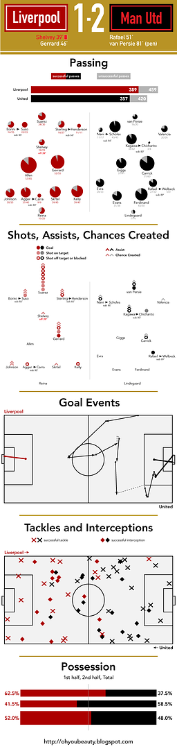
On the whole, Liverpool had the better attacking statistics despite playing with 10 men for more than half the match. Except in the one attacking statistic that counts. Otherwise, more chances created, more passes attempted and completed, and – although they're not listed above – more attacking third passes, more successful take-ons, more corners, and more crosses. A slight edge in possession by full time; the first half possession hints at how the match might have gone had Liverpool kept a full complement of players. And 14 shots to United's 8, with twice as many on target, but United scored twice as many goals. What else is new.
Meanwhile, United had far more defending to do, making more interceptions and tackles than the home side, although worth noting that Liverpool completed more tackles in the opponent's half. The disparity in clearances is even more emphatic. United attempted 44, Liverpool just 19.
2 comments :
Nice. Now put the passing percentages (individuals and teams) in the picture as well.
Nice job, Nate. Very informative pictorial/charted analysis. Easy to see who the better team is in each category and who the most influential players are. I like the relative sized pie charts for the passing stats and the symbol representation of shots/assists/chances created.
Suso 22/22 and Hendo 11/11, even Carra 9/9. Our subs 42/42. Suso/Hendo combo created 4/10 chances as subs. Suso looked good when he came on.
Post a Comment